← Selected Works
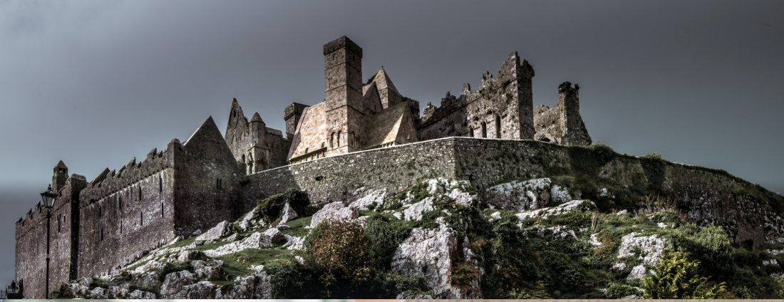
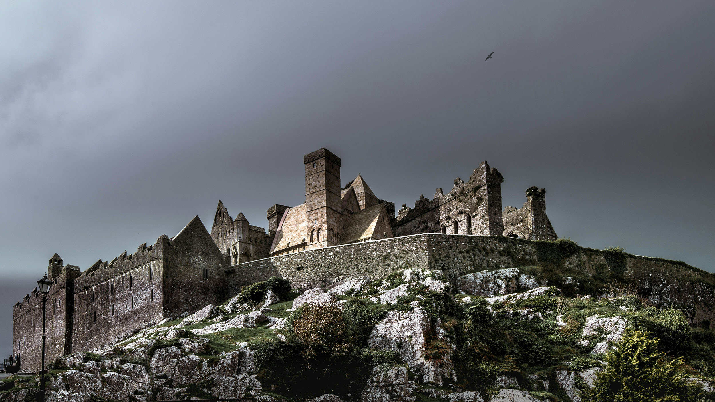
The Rock of Cashel rising above Co. Tipperary, home of Daverns since 1926

A century-old family house of luxury fashion & personal styling in Cashel, Co. Tipperary, reimagined as a considered designer-led eCommerce experience.

Year

2021

Client

Daverns of Cashel

Your Role

Lead UI / UX Designer

01 / The Challenge

A trusted high-street institution with almost no presence online.

Since 1926 Daverns had built its name on personal service: fittings, styling advice and a carefully curated wall of designer labels on Main Street, Cashel. But that experience lived entirely in-store. Their small web presence couldn't carry the brand's quality, surface twenty-plus designer houses, or reassure a customer spending €345 on a coat they couldn't try on.

02 / The Solution

A heritage-led storefront that sells the way Daverns does in person.

The redesign treats the shop's founding mark (the crown, the 1926 date, the deep navy and gold) as the spine of the whole experience. Editorial brand storytelling, a designer-first discovery model and generous product photography recreate the curated, advisory feel of the store, while virtual appointments bring the styling service itself online.

03 / Impact

A full menswear & womenswear catalogue and 20+ luxury designer houses brought online, with virtual styling carried over from the shop floor.

For us the measure of success was whether a retail store that had never needed to explain itself online, looked on screen, exactly as good as it does in reality.

02.1 / The Product

A guided walk through Daverns of Cashel

From the welcome storefront down to a single garment, every screen leads with the brand and the designer name first, then the product: the same order of trust a customer feels walking through the door on Main Street.

01 / Storefront

The welcome, set in brand

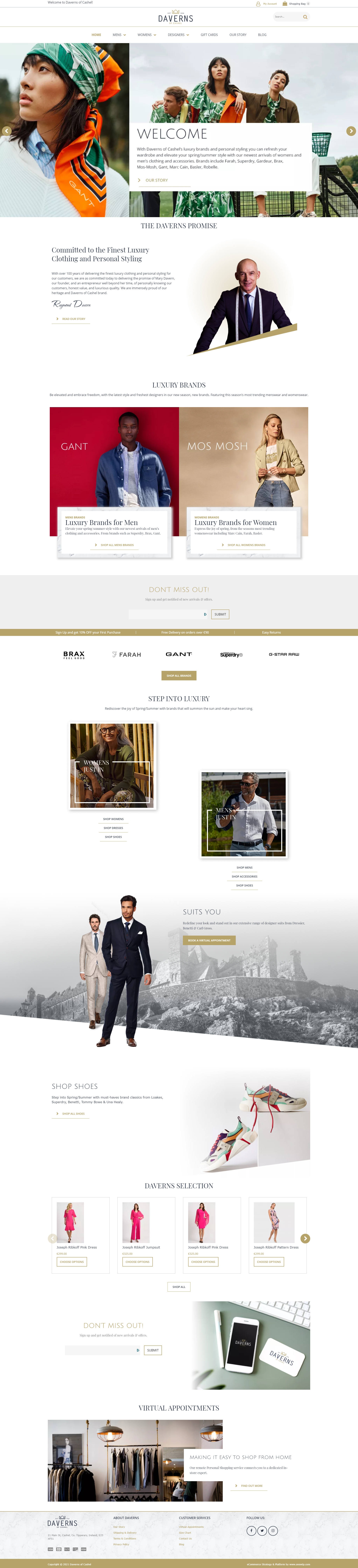
The homepage opens with a styling-led welcome and "The Daverns Promise" (a founder's note on luxury clothing and personal service) before stepping into luxury brands for men and women. It establishes heritage and curation before a single price appears.

Brand StoryEditorialCuration
davernsofcashel.com
Daverns of Cashel homepage

02 / Departments

Two front doors, one language

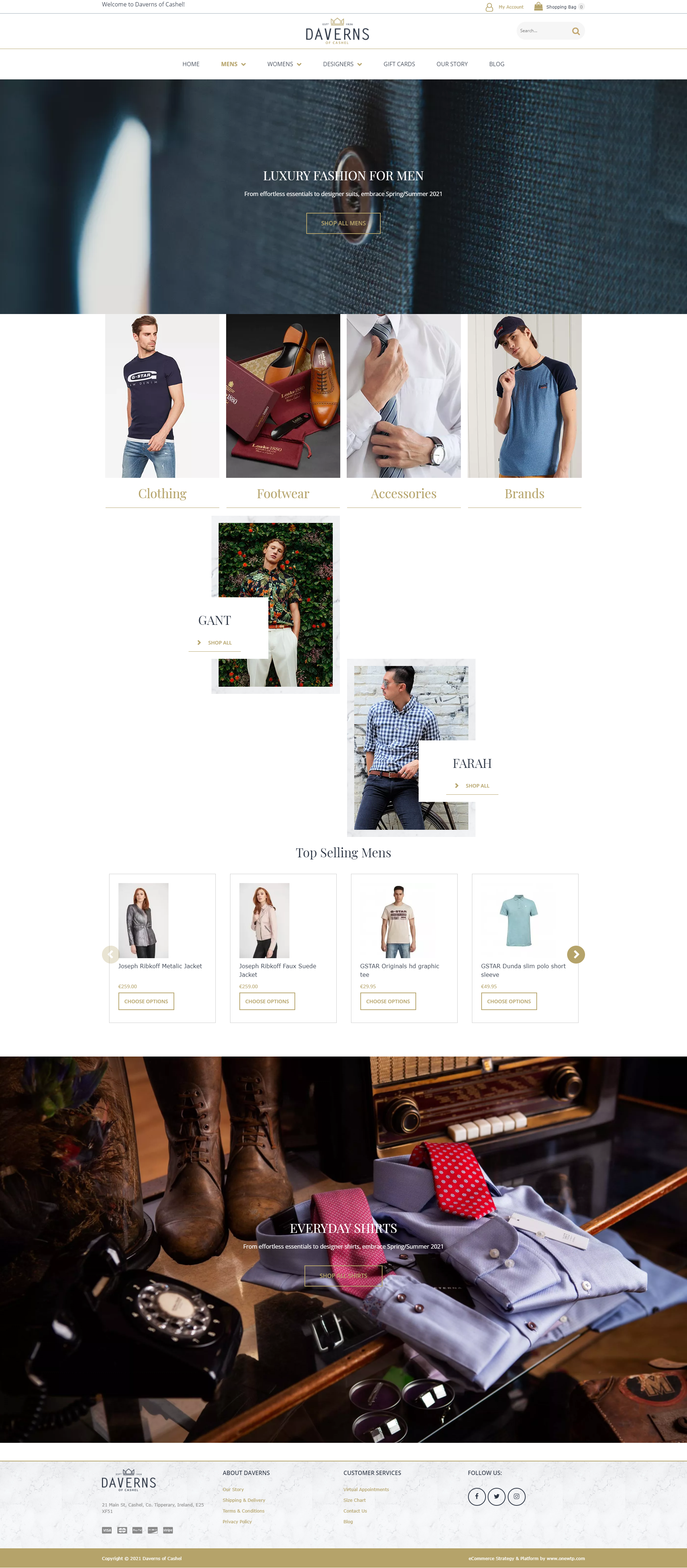
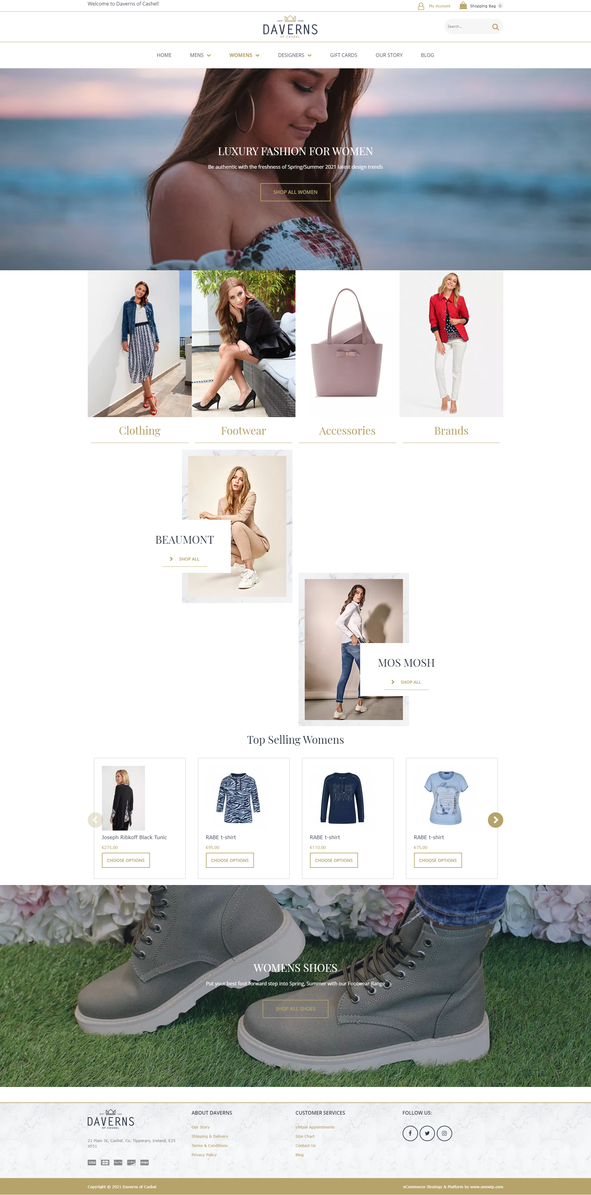
Menswear and womenswear each get a full-bleed editorial landing, then split into Clothing, Footwear, Accessories and Brands across an identical four-tile grid. The structure is shared so a returning customer never has to relearn the shop; only the imagery changes.

Department LandingShared IACategory Tiles
/ mens
Daverns menswear landing page
/ womens
Daverns womenswear landing page

03 / Designers

Shop the label, not the rack

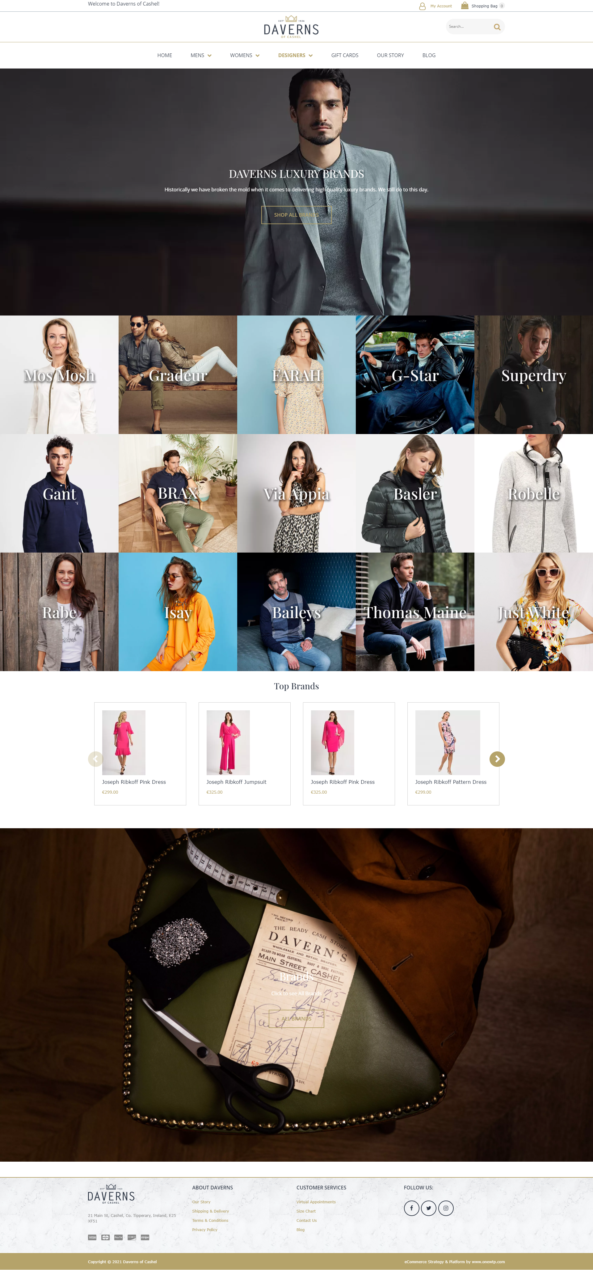
Daverns customers come for the names: Gant, Mos Mosh, Farah, Basler, Joseph Ribkoff. The Designers page makes that the primary way to browse: a single tap-able wall of twenty-plus houses, each a portrait-led tile, framed by the brand's own "we have always broken the mould" line.

Brand Discovery20+ HousesVisual Index
/ designers
Daverns designers index page

04 / Listing

Refine without losing the room

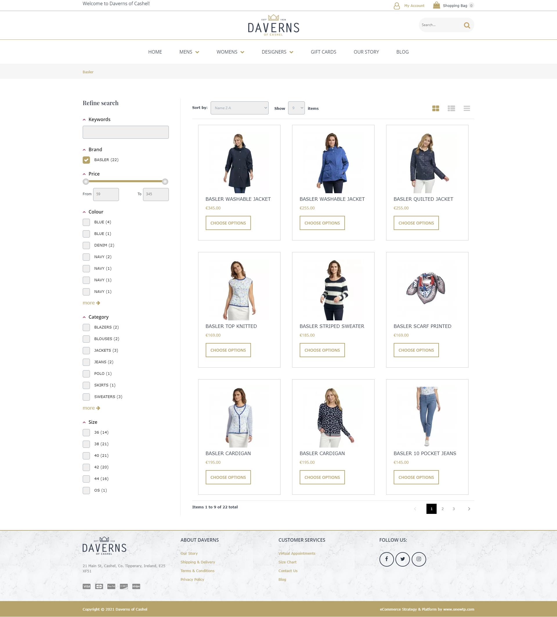
The listing view pairs a calm three-up product grid with a full "Refine search" rail: brand, price, colour, category and size, each with live counts. Filters stay quiet and gold-accented so the clothing, not the controls, holds the customer's eye.

Faceted FilteringLive CountsProduct Grid
/ womens / basler
Daverns category listing with refine search

05 / Product

Everything you'd ask an assistant

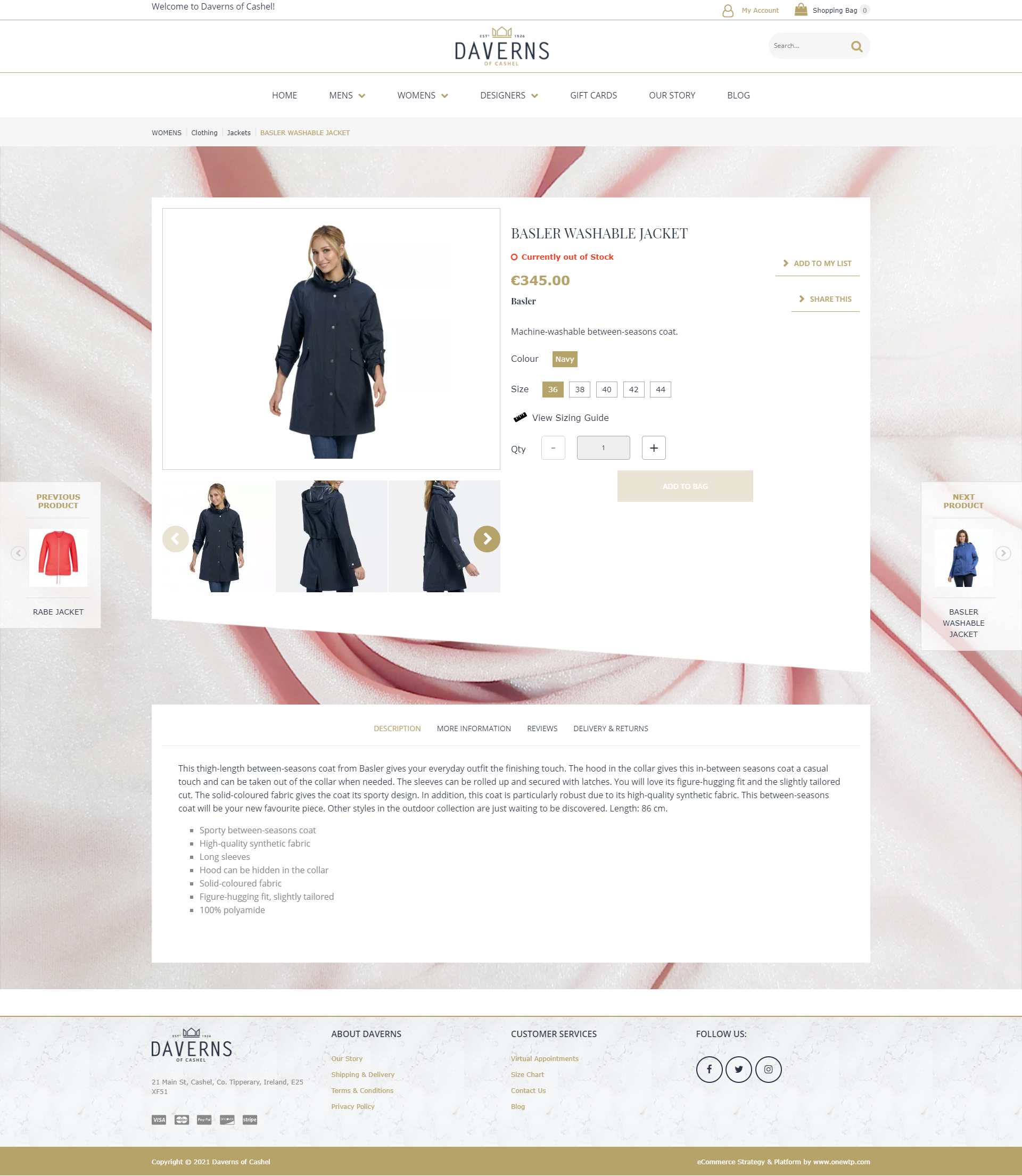
The product page answers in-store questions on screen: a large gallery with alternate angles, stock status, colour and size selectors, a sizing guide, and full description, fabric and delivery tabs, with previous / next products flanking the frame so browsing never dead-ends.

GalleryVariantsSizing Guide
/ womens / basler-washable-jacket
Daverns product detail page for Basler washable jacket
02.2 / Design System

Built around a 1926 mark

The crown emblem, the deep navy and a single restrained gold do the heavy lifting. They carry from the storefront hero to category filters and footer, so the whole shop feels like one tailored house rather than a template.

Daverns Navy

#2B3340 / Brand, Headers

Heritage Gold

#A9893F / Accent, Price, CTA

Cashel Stone

#CFC6B6 / Footer, Marble

Brand & Interface Type

Aa

A high-contrast serif sets the wordmark and section titles with quiet authority, paired with a clean humanist sans for navigation, product copy and prices, legible across long catalogue pages.

Cormorant · Archivo

Display & Interface
02.3 / Brand Identity

A crown borrowed from the skyline

Daverns sits in the shadow of the Rock of Cashel, and the shop has traded under that skyline since 1926. The mark takes the rooftop silhouette of the Rock and reduces it to a small gold crown, so the town's most recognisable outline becomes the shop's emblem without a word of explanation.

Primary Lockup

Wordmark, crown and date

Wide-tracked capitals in navy carry the family name, the gold crown and the 1926 date sit above as a single rule-bound unit, and “of Cashel” anchors the place. Nothing moves independently, which keeps the mark stable on a shopfront, a swing tag or a 32px favicon.

Daverns of Cashel primary lockup: crown, established 1926, wordmark
Origin

The Rock of Cashel

The gables, the walls and the two towers of the Rock give the crown its five-peak rhythm. It is a local reference before it is a heraldic one.

The Rock of Cashel under a heavy sky
Colourways

One mark, six grounds

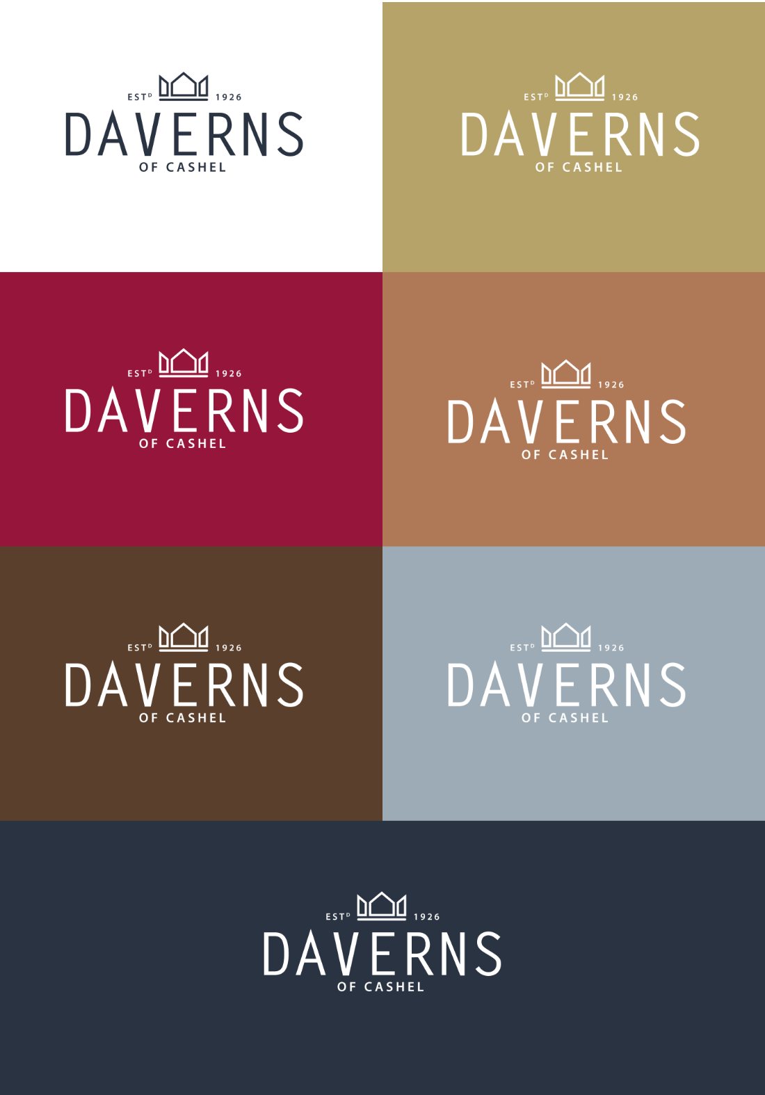
The identity had to survive a seasonal shop. Navy and gold are the constants, and a working set of wine, tan, walnut and slate blue lets window cards, gift boxes and campaign pages change with the season while the mark itself never redraws. Every version is a single-weight knockout: no shadows, no outlines, no second lockup to police.

The Daverns mark reversed across white, gold, wine, tan, walnut, slate blue and navy grounds
Positioning

Considered, not loud

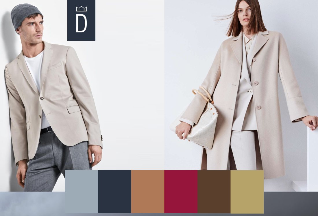
The reference points are tailoring and neutral cloth rather than fast fashion, which set the tone for the photography and the pace of the site.

Menswear and womenswear tailoring in neutral tones beside the brand palette
In Hand

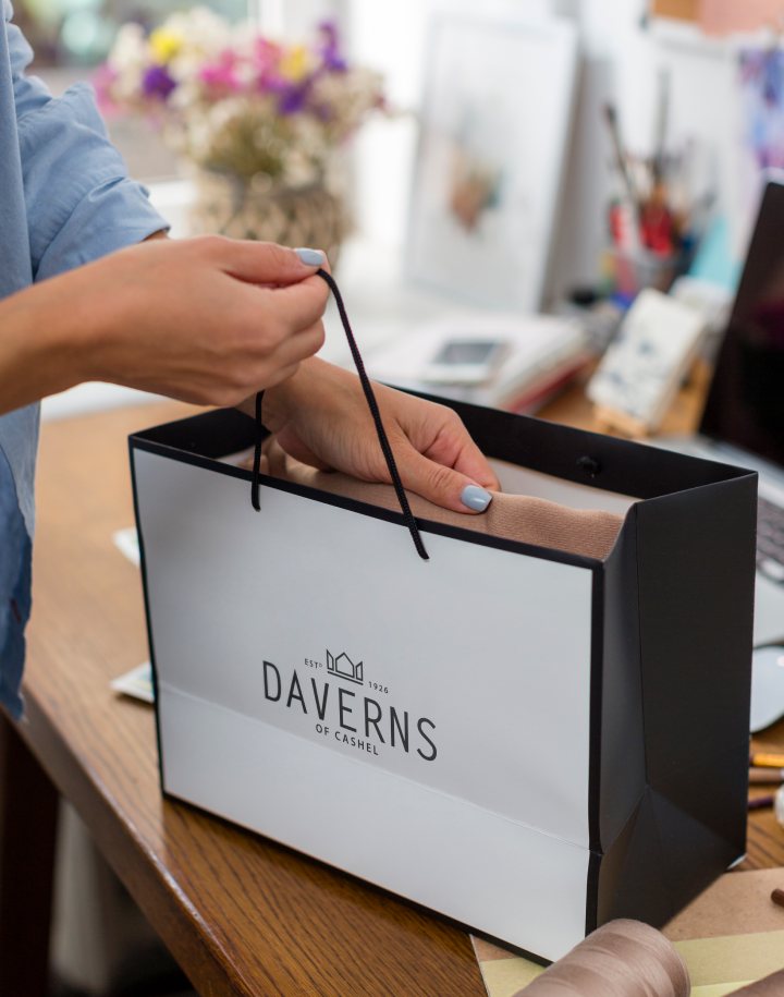
The carrier bag test

Most people meet the brand on the street, holding it. The bag reverses to navy on white with the crown at full size, the strongest piece of local advertising the shop owns.

Daverns carrier bag being packed at the counter
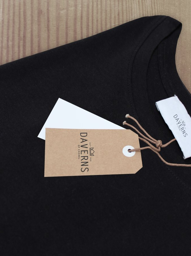
Swing Tags

Kraft and cotton

Kraft swing tag and woven label on a black garment
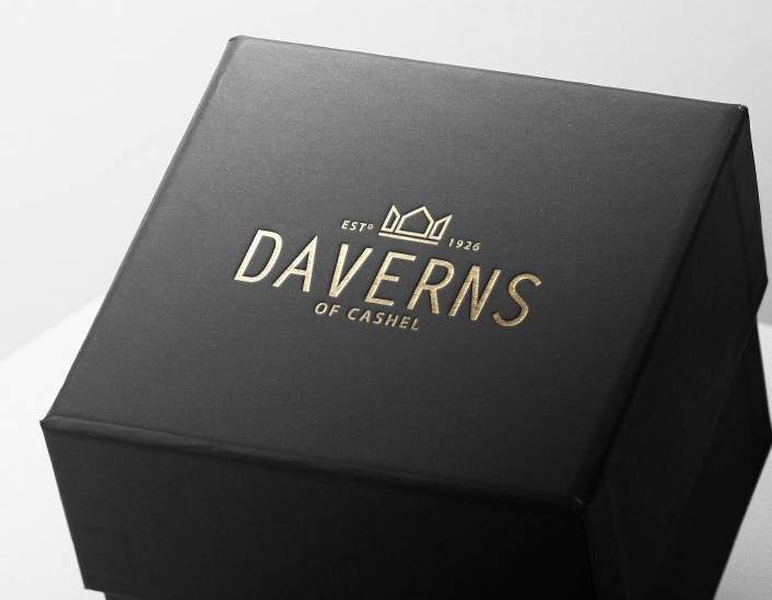
Gift Boxes

Gold foil on black

Black gift box with the Daverns mark foiled in gold
Presentation

Wine, stone, knitwear

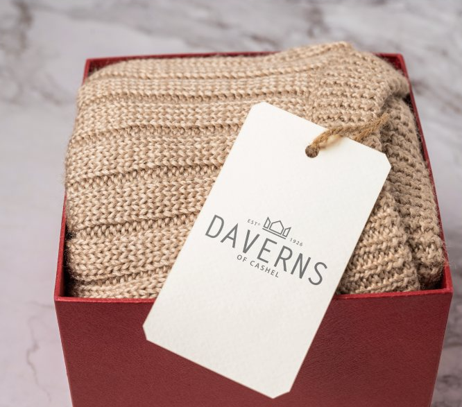
Knitwear boxed in wine with a Daverns swing tag
02.4 / Social

One line, four ways to say it

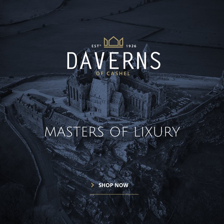
A shop this size cannot shoot its own campaigns every season, so the social system was built to make supplied designer imagery look like Daverns. “Masters of Luxury” stays fixed, the crown badge tucks into a corner, and the only decisions left each month are which photograph to use and which corner is quietest.

Get In Touch

Let's craft something meaningful together.

Contact Me

© 2026 Design by Fergal Keane

Back to Selected Works ↗Privacy ↗